Metlink Digital Screens
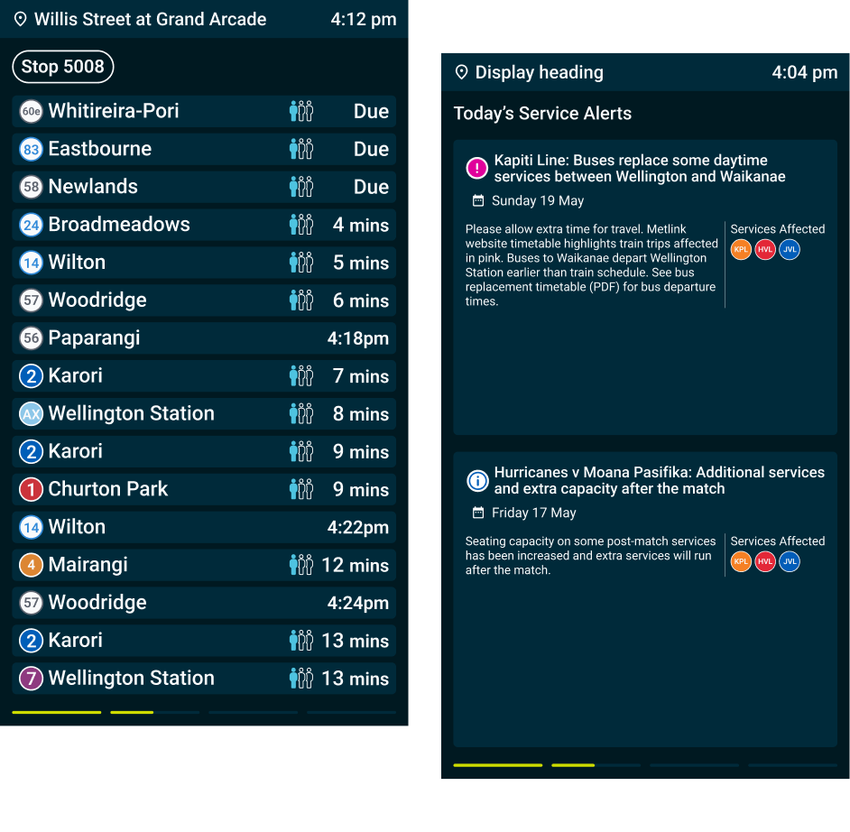
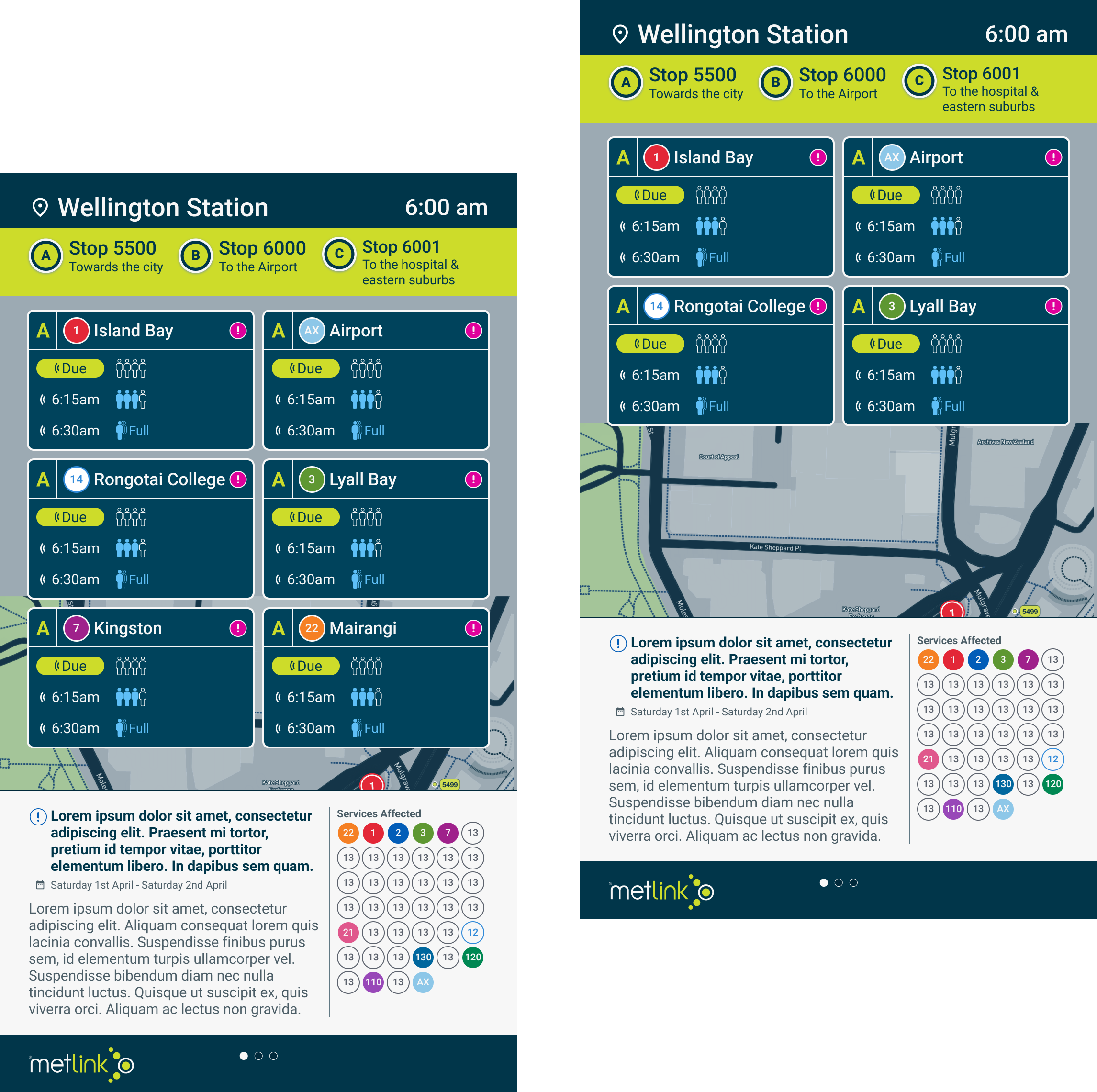
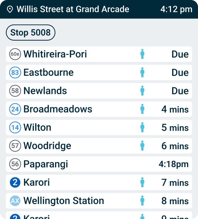
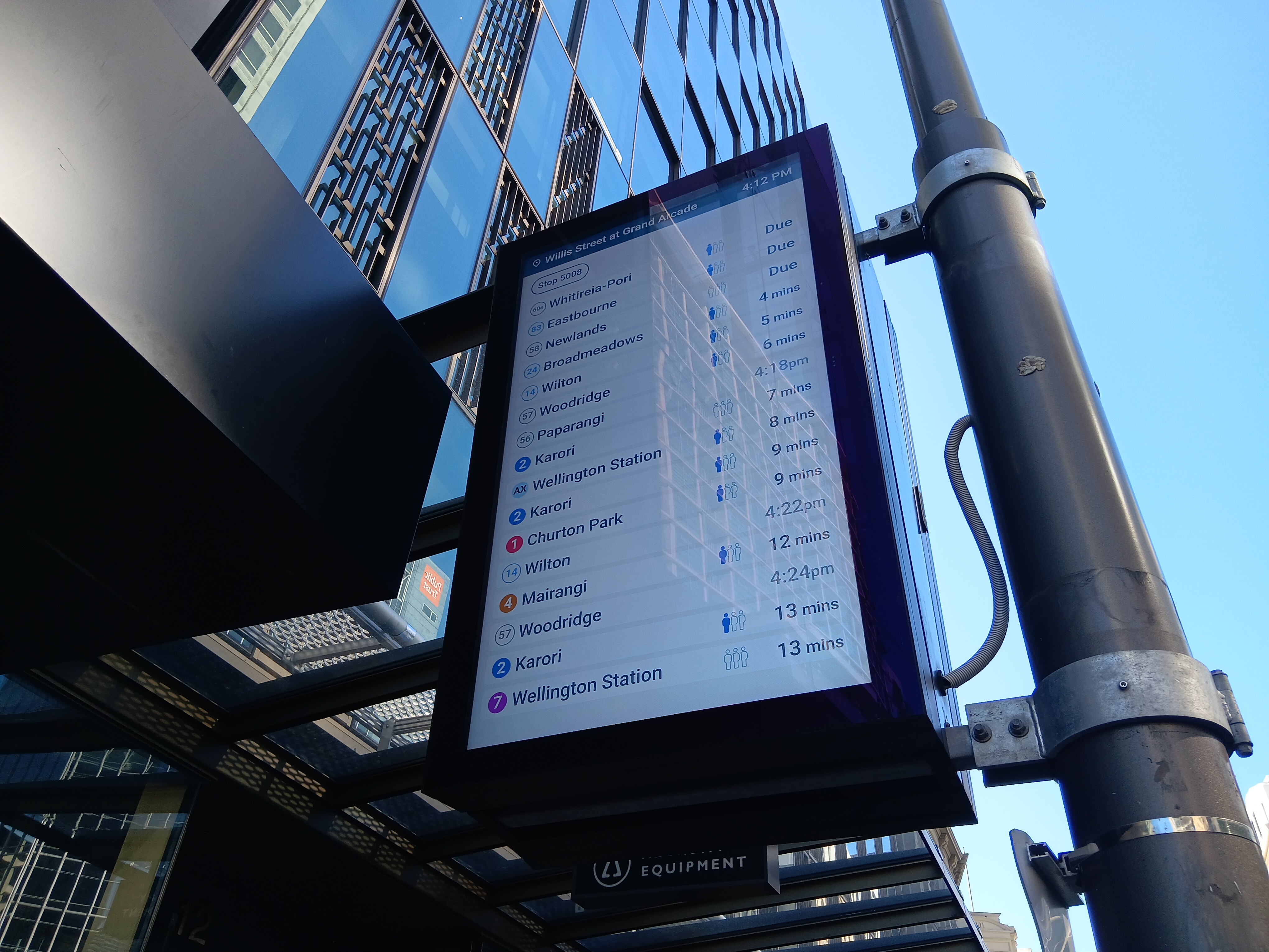
The digital screen displays for the Metlink bus and train services were looking tired and were often confusing to use.
Metlink was looking for a fresh new look and a tidy up to the designs to address display and usability issues.

UX Thinking

Accessible Design

UI Design